Website Basics: 4 Elements Every Site Needs
May 23, 2022
Have you ever searched online and found a website that may have what you are looking for, only to exit immediately either because it was aesthetically unappealing or loaded too slowly?
Your website is an excellent place for customers to learn about your business. It serves as your online home front that you can update to fit your needs.
However, even the slightest unpleasantries on your site can have prospective customers exiting before they learn anything about your business.
To help ensure that your website is both visually appealing and user friendly, we’ve put together a list of four must have design principles to guide you.
4 Basic Elements Every Website Needs
1. Design
Having clear, simple intentions on each page will create a user-friendly experience. Fresh looking and easy to access is always the route to take when designing a website.
Here are some terrific examples that show clean layouts. Clean does not mean boring: Use colors, textures, and illustrations to help create your business’s online personality.
Adidas uses black and white as the primary colors while sprinkling in other colors to bring the site to life. Notice how easy it is to access different products.
Calvin Klein is another example of using black and white as primary colors. Notice the size of the images and text.
It can be challenging to add a large amount of text and images to your site without it becoming overwhelming to your audience. Greenpeace is an example of a site with a tremendous amount of information laid out in a way browsing customers don’t want to hit the back arrow quickly.
2. Color

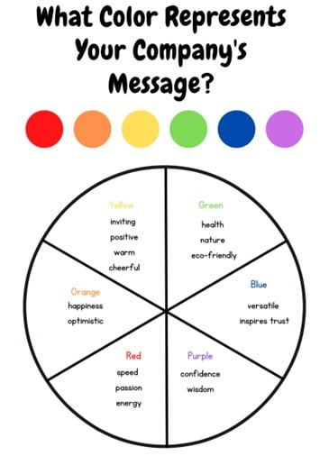
Color can effectively communicate your company’s message while invoking an emotional response.
Your color scheme influences visitors’ moods and how they perceive your business.
When deciding on colors for your website, try to keep your selection limited to just three colors.
Too many colors can overwhelm visitors, and make your site look overly busy.
Consider the psychology behind color schemes.
3. Images
As with color, imagery can trigger emotion and send a clear company message. The images you choose for your site can directly impact conversion rates. Below are helpful hints for the pictures that help websites find the most success:
- Use relevant images. Original images have a much more substantial impact than stock photos, which could make potential customers feel distrustful. (Usually, web development agencies use an excess of stock images.) Use pictures of your product, your staff, and your business.
- Use infographics. Images are more than just photos. Infographics can showcase facts or statistics about your business.
- Use images and videos of your employees. Allow prospective customers to feel connected to you. People want to put a face on the business. Show visitors what you do. Do you build homes? Show pictures and videos of your team in action. If your service doesn’t produce tangible items, show images of employees doing what they do best. Are you a tutoring service? Show your teachers interacting with students. If you don’t produce a tangible item, videos can effectively highlight why you are more valuable than your competitors.
- Use icons. Icons are a terrific element to integrate into your site. Icons are essentially visual representations of words, and studies have shown that images engage web browsers much more than words.
4. Type

Typography is part of the visual analysis and plays a crucial role in the perception of your brand.
Someone not well versed in web design would not give too much thought to typefaces.
However, typefaces effectively communicate various values that should line up with your brand messaging.
As a general rule, use a maximum of three fonts on your website.
Too many different fonts interrupt the visual design, creating an unpleasant experience for customers.
Fonts with open letterforms like Georgia and Proxima are easiest to read on computer or phone screens.
However, Open Sans is also a popular font that is used widely across websites.
The best font size for websites will range between 12 and 20 points.
The Nitty Gritty of Your Website
Domain
If you are updating or adding to your site, you already have your domain. However, the domain is a critical element for a new business that does not yet have a website.
The domain is the words after “www.” You get a domain from a domain registrar. Your web developer will handle this part for you.
There are several generic top-level domains (gTLDs) like .com, .org, and .net. You hear these referred to as extensions.
Your domain name is the first impression a customer receives about your business. It helps your business’s credibility.
If the name you want is already taken and used with a gTLD, you are better off changing the name versus using a ccTLD (country code top-level domain) like .io, .us, and .eu, unless you are a geo-based brand. These domains tend to not look credible to consumers.
The best domain is an exact-match domain name with a .com extension. Below are tips to help you decide on your domain name:
- Consider search engine value. Every company’s goal is to rank high with Google, and there are several ways to make that happen; however, in this article, we are sticking with how your domain name helps with search engine value. If your domain name offers value to the customer and includes a .com, you will likely have a higher search engine value.
- Keep it short and unique. If you cannot get an exact-match domain, keep your domain name memorable by making it short and unique. Any name longer than 15 characters will be challenging for customers to remember.
- Steer clear of hyphens and numbers. You want your domain name to be straightforward and catchy. Incorporating hyphens and numbers make it less straightforward and catchy, and can result in users entering the wrong website address.
- Emphasize branding. Your domain name is an opportunity to improve brand recognition. For example, if your company offers online tutoring for young children, kidtutors.com would be a great domain name. This domain name works well with advertising efforts and is unique and easy to remember.
Hosting
Web hosting supplies a secure place online that makes your website’s content accessible to users.
If digital marketing or web development is not your forte, you probably haven’t given hosting much thought.
There are over 300,000 web hosting providers worldwide.
And just as not every website is equal, neither is every web hosting company.

You have a choice of hosting environments: Virtual Private Server (VPS), dedicated server hosting, cloud hosting, managed hosting, colocation, and shared hosting. Web hosting is the most critical part of developing your website.
Building your site on the wrong host is like building a house on a fault line. You won’t notice anything wrong initially, but as time passes, your site begins experiencing difficulties, ranging from slow load speed to technical glitches and lack of security.
Here are some considerations when selecting a host for your website:
- Secure Host Provider. Security is a huge ranking factor for Google. Unsecure web hosting can be the death of your SEO. Although you can take a proactive stance to secure your website, such as keeping software up to date and using complex passwords, a good hosting service will simplify everything.
- Site Load Speed. A slow site load speed is another deadly SEO disease for your site. How quickly your pages load has a significant impact on your Google ranking and website traffic. How often have you come across a site that wouldn’t load and just clicked out? Shared hosting plans don’t manage their server loads often enough, and some do not at all. You must be aware of how often your host manages server loads.
- Frequent Backups. A good web host will regularly back up your database. This is relevant because your host can restore it immediately if you are hacked or your site goes down. Without frequent backups, you can lose everything.
- Scalability. As your business grows, your traffic volume increases. Scalable hosting is how bandwidth and storage are added to meet your growing needs. Make sure the provider you choose can keep up with increased demands. Once your website is well established, you do not want to change hosts.
The Bottom Line
Creating an effective website requires knowledge of the basics of website development.
From understanding color psychology to choosing the right hosting environment, arming yourself with a foundational understanding of the principles of design and development will take your online storefront to higher levels.


