Three Colorful Examples of Content Marketing Success
July 12, 2024
Color is a powerful tool for marketing—one that can be wielded by a company to achieve either fortune or misfortune. That’s because colors are deeply connected with human responses and mental/emotional associations. Those flashes in customers’ brains impact their buying habits.
This blog explores the use of color for strategic content marketing by three companies who are household names. Color has worked overtime for these companies, sometimes for many decades. In fact, it has worked so well, you may be able to guess the names of these brands just by knowing their colors.
Lyft’s Content Campaigns: Marketing Goes on a Pink Joyride
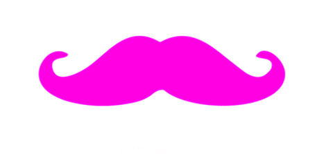
Who would think of putting a pink mustache on a car? And who would think that pink fuzz could launch a highly successful human transportation company?
You know who—LYFT!
Operating in the US and Canada, the ride-sharing company predates Uber by three years. The business evolved from Zimride, a long-ride-centered company that was started in 2007 by Logan Green and John Zimmer. In 2012, the founders added Lyft for ride sharers with shorter trips in mind and gave the name to the entire company in 2013.
A friend of the founders, creative marketer Ethan Eyler had a light bulb go off in his mind one day while driving a dreary daily commute. His subsequent online search for “car mustache,” returned an empty screen.
Eyler soon produced and tried a black “carstache” on his own car, and people loved it. The marketer quit his “boring day job” and built a website to sell carstaches in five colors including pink.
Zimmer and Green took a liking to their friend’s whimsical product and started giving away the faux fur and polyester grill ornaments for fun at Lyft get-togethers. Before long, the association with their cars was made, and the pink mustache would become part of the Lyft logo.
Eyler developed the Carstache 2.0 for Lyft, making it with fade-resistant “super fur” and clips for easy fastening and removal.
As drivers were asked to put the fuzzy pink facial hair on their vehicles’ fronts, the Lyft cars became unmistakable. The fuzzy version would evolve into a color-changing dashboard signal plus a mustache-shaped light to adorn the cars’ faces.
For executive-type, “black car” rides, the pink mustache took on a more sophisticated, petite size and became a lighted “glowstache.”
This bit of pink automotive humor enabled the company to stand for fun rides. It also created a likeable kind of engagement with women.
“The mustache is actually a symbol of trying to connect and to have fun,” Zimmer has said.
Lyft’s pink branding has worked uncommonly well, distinguishing the company from all others on the road. As in many corporate success stories, the logo can take a lot of credit.
Lyft lifted the pink mustache from its logo in 2012, but the one-word, fat letter symbol continued to wear bright pink.
An exception to pink color theme has recently been made for the Lyft Pink membership program’s logo, incorporating black and a range of blues in the logo, but keeping the traditional color in the name.
Begun in 2022, the membership program has been recently revamped to reduce its price and expand its benefits to include bikes, scooters, rental cars, electric vehicles, and more.
With the ridesharing market on the rise, Lyft’s whimsical use of pink (the color and the word) has fueled its steady ascent in the sector.
By 2016, Lyft, Inc. reached revenues of $700 million. The company’s income has grown steadily and impressively for the past several years; recently, Q1 of 2024 saw a 27.65% increase year-over-year.
Ikea’s Blue and Yellow Strategy: Content Marketing That Waves a Flag
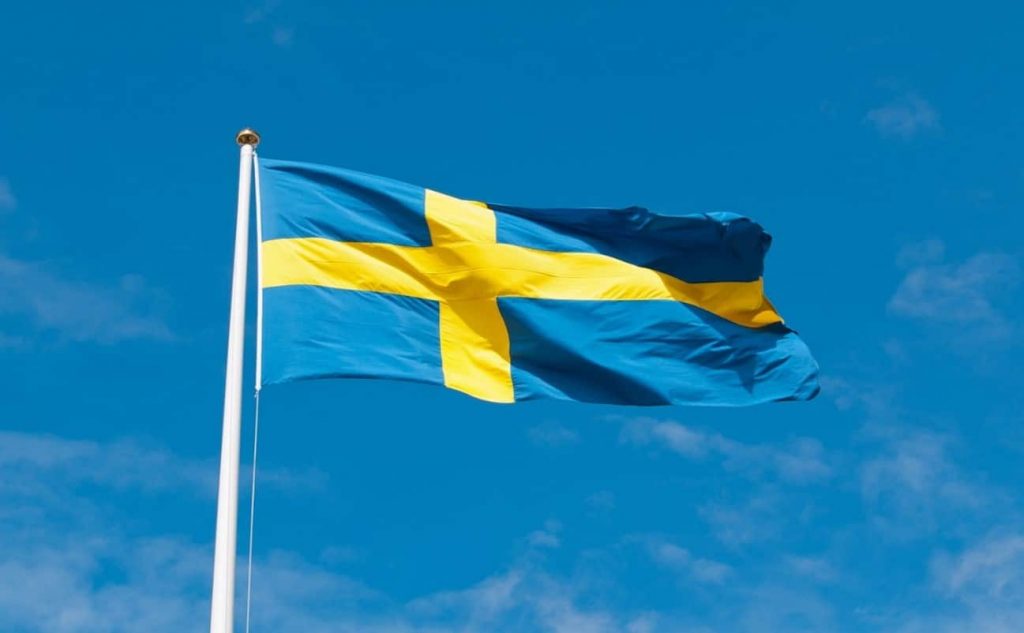
It’s hard to imagine a company more linked to its national roots than Swedish furniture producer IKEA. So, it just seems right that Sweden’s flag with its blue background and yellow reclining cross provided the color scheme for the company’s logo, store design, signage, and more.
As with the flag, the simple theme makes an enduring statement about the brand’s products—clean designs, simple assembly, and lasting practicality.
Even so, the colors of his country’s flag weren’t yet on Ingvar Kamprad’s mind when he founded IKEA in 1943. A “businessman” since boyhood, he formed the name from his own name and that of his parents’ farm and put out his first furniture catalog in 1945. By 1955, his workshop became a showroom.
The company’s first logo, circa 1951, was a wine-red wax seal emblem with small white italic lettering. The design was replaced the next year with white lettering on a diagonal brown background, chosen perhaps as the color of wood, the material most used at the time by IKEA.
The logo’s design would go through several ideations in the years that followed, the four letters always placed within a framed oval. Its colors were black and white, then a bright red and white, and finally, blue and yellow by 1983.
The current logo is done in a custom-created font called IKEA Sans, which was slightly redesigned in 2019, wisely leaving the iconic colors untouched.
For IKEA, the most well-known of Swedish companies, the colors of the flag serve as an identifier that is recognized worldwide.
The colors also play to two sides of Swedish identity and lifestyle–blue and yellow respectively denote dependability and joy—qualities that unite to sell items customers will happily live with and use daily.
The brand’s name and colors are its symbol, and that simple marketing strategy has worked on a global scale. The company now has over 460 stores located in 63 countries. In 2023, IKEA Group’s revenue hit 47.6 billion euros.
Heineken’s Content Marketing Platform: Nature in a Green Bottle
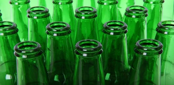
The vivid green Heineken bottle, emblazoned with a red brewer’s star, is a legacy its countless drinkers hold in their hands.
Gerard Heineken was just 22 in 1864 when he bought the Haystack Brewery in Amsterdam. Despite his youth, he already knew he would distinguish his beer by using green bottles to show its liveliness and closeness to nature.
There have been eight versions of the Heineken logo since young Gerard began the company —all green, all with stars, and most with red elements. The star was turned red in the 1930s.
Today, the green bottle and logo symbolize freshness, the environment, and sustainability wherever Heineken is sold around the world. The five-pointed red star represents the beer’s natural components: hops, barley, water, and the special Heineken A-yeast.
In line with its love of all things green, in 2020 Heineken introduced “Evergreen,” a growth plan that emphasized doing good to the Earth. The plan is represented by the “Green Diamond” symbol, whose four vertices point to Growth, Sustainability/Responsibility, Capital Efficiency, and Profitability.
In 2021, Heineken dedicated itself to decarbonizing all production by 2030, and to continuing to work with suppliers and partners to reach total carbon neutrality in its entire “value chain” by 2040.
As of this writing, 67% of all the barley used by Heineken and 97% of its hops are sustainably sourced. The company is working with farmers to get 100% sustainable harvests in every country it sources grain from. After brewing, leftover barley grain becomes delicious cattle food, helping to eliminate waste.
Heineken uses renewable energy at its brewery in Den Bosch, the Netherlands, site of the biggest solar panel park on the globe, and at 2 breweries in Austria. Recycling is a high priority, too, with 57% recycled glass bottles and 48% recycled aluminum cans (in Brazil, the cans are over 95% recycled aluminum.)
Another piece of the sustainability agenda is ensuring that limited community watersheds continue to provide plenty of water for residents’ use as Heineken sources them to make its beer.
Besides its environmental focus, green, as a primary color in nature, universally speaks of life and growth—ideal for a still-growing company.
The star, in bright red, boldly denotes energy, and as a traditional brewer’s star proclaims the purity of the brewing process. It’s not a stretch to say it also symbolizes the brand’s rise to international stardom—both figuratively and literally.
The unmistakable bottle has made guest appearances in films and videos. There has even been a movie, Kidnapping Mr. Heineken, made about the real-life abduction of a member of the brewing family and the huge ransom paid for his return.
Heineken operates 167 breweries in 70 countries around the globe and employs 84,000 people. Its annual revenue is approximately 24 billion euros.
Colorful Content Marketing Campaigns That Work
Maybe you’d love to use just-right colors in all your content marketing, but you’re not a color marketing or content writing expert. That’s okay.
If you could use some help with implementing a color-oriented identity for your brand, an experienced content marketing agency can fill the bill.
Put the power of color to work in all your content, from your logo to your website, marketing collateral, and social media, so when customers see those well-chosen hues, they’ll think of you.