The Psychology of Font Choice: How Typography Impacts Content Engagement
July 19, 2024
Picture it: You’re at your desk, on your phone, doing what?
Scrolling, scrolling, scrolling.
All day long, we’re bombarded with content in all its glory and in all its forms—podcasts, user manuals, video ads, photo posts and memes, blogs, reports… It’s an endless flood of content whooshing by so quickly that most of it doesn’t leave much of an impact on us.
But some content does, and some even encourages us to interact and engage with it. So, the question is: What makes that piece of content more appealing than others?
In other words, understanding various psychological concepts about how people perceive information is key for both individual creators and content creation companies alike. And while the answer to the question above is admittedly complex and multilayered, an integral factor impacting how people react and interact with content is rooted in the visual element.
The visual aspect includes color and imagery, but did you know that it also includes typography? To what exactly does the term typography refer? Can you name the original typeface? Do you know how typography can affect engagement levels? Did you know that Ferris Bueller is the father of typography?
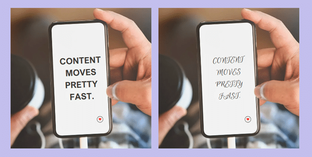
Okay, I made that last one up. But I’m pretty sure it was Ferris Bueller who said, “Content moves pretty fast. If you don’t apply the psychology of font choice, they just might miss it.”
Anyways, let’s skip roll call today and get right into it! This is your guide to how typography can impact content engagement levels.
The Science Behind the Subconscious: Understanding Font Psychology
Research from Monotype, a leader in fonts and type technologies, indicates that fonts can evoke specific emotions and influence how we perceive information. Accordingly, font psychology refers to the study of how different fonts influence our thoughts, feelings, and behaviors.
Font Associations
Think of all the different fonts there are: In a way, each font carries its own personality, and elicits its own emotions and perceptions in viewers’ minds.
For instance, bold fonts are often associated with strength and importance, while script fonts can feel more playful or elegant.
Serif fonts refer to those with small lines attached to all of the letters; think Times New Roman and the like. Serif fonts tend to present a more traditional appearance, giving the font a vibe that evokes credibility, authority, and professionalism. (Yes, I did just use the words professional and vibe in the same sentence, don’t @ me! Wink.)
In contrast, sans serif fonts don’t have serifs. Since these fonts don’t feature the little lines attached to the letters, they generally foster a more simple, modern feel. According to Adobe, sans serif fonts are now frequently used in cutting-edge designs.

Thus, we can see that typography isn’t just about selecting aesthetically pleasing fonts. Rather, it’s also about tapping into the subconscious associations and emotional responses they evoke.
This Font or That Font: The Impact of Font Choice
The font you choose plays a significant role in not just how your content looks, but also how it’s received and perceived by your audiences.
Impact on Visual Appearance
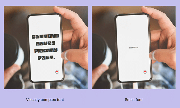
Font choice is an important part of your content strategy, as it directly impacts how readable and accessible your content is. And when it comes to content, accessibility is paramount. Visually complex fonts or small type sizes can strain the eyes, which can then deter readers and even lead to negative repercussions on your brand’s overall visibility and reputation.
A well-selected font, on the other hand, enhances content’s readability and makes it more accessible for everyone. This subsequently makes the content both more digestible and more likely to engage users.
Impact on Audience
Font psychology tells us that different fonts evoke different emotional reactions that influence our thoughts and behaviors. Thus, font choice can significantly impact how we perceive content—whether we find the content inviting, credible, relatable, or worth engaging with.
Moreover, font choice also affects how we perceive the creators or brand behind the content itself. Whether we actively realize it or not, font contributes to how established users perceive a company to be as well as what a brand’s overall personality is. Understanding these nuances enables content creators to strategically select fonts that resonate with their target audience, thereby maximizing content engagement and fostering meaningful connections.
For example, if a brand creates content that uses a classic serif font, users are more likely to perceive the brand to be more experienced, professional, and established in their relevant industry. Accordingly, target audiences that encounter this content are more likely to be interested in engaging with it.
In contrast, a brand that features a sleek, modern font in its content may be perceived as a newer company, potentially with less structure and reliability. And just like the example above, target audiences that encounter this content are more likely to be interested in interacting with it.
Choosing the Right Font for Your Content
As you can probably guess by now, there isn’t a one-size-fits-all when it comes to fonts; some fonts are just better suited for certain brands than others. So how do you know which font is best for your brand’s content?
We have a few suggestions to help you select a font that aligns with your content:
- Consider your audience.
- Understanding target audience demographics like age, interests, and background is paramount. Ask yourself: Whom are you trying to reach? With whom do you want your content to resonate? A font that resonates with a younger, more casual audience may not suit a professional, corporate campaign targeting older demographics.
- Consider the purpose of your content and your content campaign’s goals.
- Choose a font that complements the purpose. Ask yourself: Is your content informative, playful, or persuasive? Select a font that reflects the tone, values, and personality of your brand or content creator.
- Execute A/B testing.
- A/B testing of different fonts can provide valuable insights into which font resonates best with target audiences, allowing for data-driven decision-making.
- Prioritize accessibility.
- Prioritizing accessibility is key: It ensures the content remains readable across various devices and screen sizes, fostering an optimal, inclusive user experience and maximizing engagement potential.
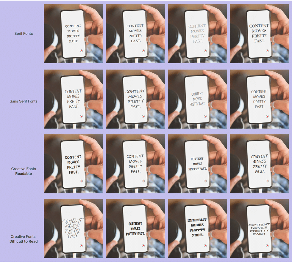
And to help you get a better overview of the effect of different fonts, check out the graphic below:
Content moves fast: Choose the right font for your brand with The Writers For Hire.
The bell is about to ring, so we had better wrap this class up!
Whether you’re a big-name brand creating a new ad campaign or need to type up a sick-note so your kid can “stay home and rest,” font selection is an essential component of your content’s success.
But not everyone can play hooky, and even the best content marketing brands benefit from a helping hand. So, if you need help with your content campaign, our team at The Writers For Hire has your back! We can optimize font selection to help boost your content’s appeal to target audiences and increase user engagement.
Remember, content moves fast. But your content? Together, we can make sure no one could possibly miss it.