Color’s Impact on Strategic Content Marketing Success
June 4, 2024
Color and content marketing are as inseparable as blue from the sky or green from the grass. It’s fascinating to think about the difference color choices make on consumer perceptions and behavior. Consider:
- By itself, color can affect up to 90% of a first impression.
- Color increases brand recognition by 80%.
- Among customers surveyed, 85% say color has more influence on purchase decisions than any other factor.
- Customers’ judgements about quality are connected to color: The darker a product, the better its quality is thought to be.
- Colors give you access to the deeper levels of your audience’s consciousness, which is why they have such content marketing clout.
As every good content management service knows, color will be either a positive or a negative in your marketing content. And, with the amount of visual input the public is exposed to, content must stand out and resonate to get noticed.
Colors and Their Implications for Content Strategy
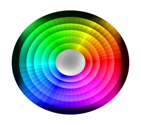
The color wheel above is a graphic illustration of the relationships between colors, which are classified as primary, secondary, or tertiary. Colors of varying wavelengths interact with the human nervous system in ways that reliably produce certain emotions.
Each color has been used effectively by brands for their content, with the tip of the content “iceberg” being the logo. Savvy marketers will tell you that getting the color of your brand’s logo right is a crucial early decision with long-term implications. Here’s a list of colors and how each is commonly perceived:
Primary Colors
These basic bright colors are the ones that can be combined to make every other color. Children are famously drawn to them, but they work with adults, too.
- Red is stimulating and energizing. It’s the color of urgency and is used to spur action. No wonder STOP signs are red to grab attention. The Red Bull logo is a great example of red branding.
- Yellow is a lively, summery color that imparts positive vibes and can also imply urgency in the right context. It’s great for highlighting within your content. MacDonald’s golden-yellow arches have always denoted fun.
- Blue can mean coolness, tranquility, reliability, and fidelity (as in “true blue”). Because companies want to build trust, blue is among the most-used colors in content marketing around the globe. The blue General Electric logo, for example, has long been a symbol of product integrity.
Secondary Colors
These are made by simply mingling equal parts of two primary colors.
- Orange, a mixture of red and yellow,makes a daring statement. It says, “See me!” in a happy way. Orange is favored by all kinds of businesses who want to signal excitement. Children of all ages like it, too; the Orange Crush logo has been getting their attention for generations.
- Green is blue and yellow combined. This fresh color has a variety of associations, from “greenbacks” to environmental friendliness, healthiness to serenity. With the “greening” of the energy sector, some energy firms have done green rebranding. The Whole Foods green logo has always said “healthy” to food shoppers.
- Purple, a blend of red and blue, has symbolized royalty, opulence, and luxury since ancient times when purple dyes were rare. It can also denote femininity. The Hallmark brand, with its elegant purple script logo, has used the color very successfully.
Tertiary Colors
Tertiary colors are made by mingling a primary color with an adjacent secondary color on the wheel. They include yellow-orange, red-orange, red-violet, blue-violet, blue-green, and yellow-green. Their implications for content strategy combine those of both colors.
“Other” Colors
- White is the “blank” color that results when all colors are combined. It provides a stark, pure foil for other colors. When used with black, it makes the frankest statement of all. The North Face brand uses a snowy white logo on a solid red background.
- Black used in content is a powerful, timeless way to make an impression. The double-C Chanel logo, for example, lends an air of finesse to the brand’s marketing.
- Gray, a mixture of the previous two, is refined and calm. It complements other colors easily as needed. The gray Mercedes-Benz symbol really couldn’t be any other color and give the same elegant, understated impression.
- Brown is the muddy result of mixing blue, red, yellow, and black. It is perceived as rich and deep, sturdy, natural, and, sometimes, masculine. Hershey’s has been selling massive numbers of its brown-wrapped chocolate bars since 1900.
- Pink is an overtly feminine color formed when red and white combine. It speaks of softness and gentleness, beauty and comfort. Mattel created a successful pink phenomenon with its line of Barbie dolls and accessories.
How Content Marketing Brands Best Use Colors
Colors evoke feelings in audiences and are associated with values. How do you want to be perceived as a brand? Color will make a difference. To harness color as a tool for optimizing your content strategy, there are some principles to keep in mind.
First, color is one of the most influential factors in content, sparking instinctive associations and responses.
Baby pink is associated with gentleness, green with nature, gray with steel and structure.
Fit your color choices to the associations you’d like your target audience to make between your offerings, the character of those offerings, and the sensations or feelings associated with them.

While you’re thinking about the audience’s perceptions of various colors, consider their saturation (intensity) and look at various tones (colors mixed with gray) and shades (colors mixed with black). These color subtleties influence the character of your marketing content.
Second, the best colors for your brand’s marketing are those associated with the ways your customers see themselves. Because people’s identities are partially about the brands they choose, colors for marketing content should play into the values of target customers.
For example, to appeal to nature-concerned Gen Xers, consider the colors of nature, like grass green, daisy yellow, and sunset orange. Explore purple or black for an upscale beauty brand, or whimsical colors for children’s products.
If your niche is already full of companies that use, say, yellow or orange for sunscreen marketing, you may want to consider other colors to distinguish your brand from the crowd.
Third, color is integral to your brand’s identity. Research Gate reported that its focus group results “were consistent with previous research that found, through color, brands effectively establish an identity, communicate a mood, and form a relationship with consumers.”
Color gives your company character and individuality. Your brand is known, in large part, by the colors you use to stamp it on customers’ memories.
Brown delivery trucks or orange smiley arrows–everyone knows exactly what they represent. Color helps brands become pieces of their larger culture.
Fourth, one or two colors usually form a brand’s signature, AKA its logo. Those colors are always present in its marketing, with complementary marketing colors chosen for compatibility with the logo colors.
It’s been shown that most consumers like colors of similar hues and color palettes that use an accent color of marked contrast. There are online tools, such as Canva’s, to help you choose well.
A Few Color Cautions for Strategic Content
A color’s perceived character comes from associations made through life experiences, and those experiences happen in the context of a customer’s culture.
Although the emotional effects of almost all colors have been shown to be similar in every country, international businesses may need to take some variations in color meaning into account. Do your research on color connotations where you plan to operate.
Because keeping your brand’s colors constant is vital to identity, if you are international, it’s probably best to go ahead and pick a palette that makes a positive impression in all your markets.
There are some general visual no-no’s when it comes to color choices for content. Wise designers suggest that you avoid:
- Neons. They are hard to look at, hard to read, and a bit disturbing.
- Colors that vibrate. Two highly saturated colors together, especially two opposite each other on the color wheel, can appear to move.
- One light color on another. This combination is notoriously hard to read.
- One dark color on another. The same is true.
- Rainbow spectrums of colors. These are too dominating and distract from the message.
- One bright color on another. This scheme doesn’t provide enough contrast to make an impact.
Color, Conversions, and Content Creation Companies
Your content strategy’s goal is, of course, to persuade your target buyers to buy what you offer.
Color is the most important factor influencing a decision to buy, making up 60% of the decision-making process to buy or turn down products. Among customers making impulse decisions, an amazing 90% of those choices are made based only on color.
Although, as a Psychology Today article noted, “It is definitely true that there is no single best color for conversions,” it is known that vivid colors in the primary and secondary groups are best for calls-to-action.

Just changing the color of a call-to-action button from green to red has been found to up conversion rates by 21%.
Colors are also navigational tools for customers, so your content should consistently use the same color for the same purpose.
If the “Buy” button is bright magenta, it should always be that color, and it should contrast, not blend, with its surroundings.
There’s a lot to think about when making influential color decisions for your brand’s content.
If you could use some help with making your marketing powerfully color-centric, a Content Creation Company can lend a valuable hand in that process.